ROLEYEARBranding, UI & UX,
2023
Case StudyLeft Behind
Left Behind is a real-life escape room in Manila, Philippines, that focuses on creating concepts that engage customers' physical, mental, and social capabilities. Among the limited players in the market, their immersive experiences and tenacity have set them apart, offering adventurers a unique and captivating journey.
Left Behind is a prominent player in the escape room market in Manila, offering exhilarating experiences that captivate adventurers.
However, their digital presence is outdated and does not meet modern standards and user expectations. Their website has remained unchanged since 2018 and does not offer an optimal user experience.
Having previously designed their logo, I expressed my interest in redesigning their website. This overhaul aims to ensure a seamless and delightful user experience for the increasing number of users accessing the site.
THE PROBLEMLeft Behind’s website is outdated and has poor user experience. Despite being crucial for booking, it fails to meet modern standards and user expectations.
THE SOLUTIONA redesigned website that places a strong emphasis on creating an immersive, contemporary experience to enhance user engagement.
user interviews and site evaluationDuring the initial stage of my research, I wanted to gather valuable insights and feedback from two distinct groups of participants to better understand the expectations and requirements of escape room users. The two groups were as follows:
1. Experienced Escape Room Users: This group consisted of individuals who had previously booked and participated in escape room activities. Their feedback served as an essential resource for understanding the strengths and weaknesses of current escape room websites, drawing from their experience and expectations.
2. Potential Customers: This group provided essential insights into expectations and needs, offered a roadmap for understanding potential barriers, and facilitated strategies for conversion.
I conducted hour-long one-on-one Zoom user interviews with six participants to gather this information. During these interviews, I asked them about their experiences booking escape rooms and evaluated Left Behind's current website with them.
Additionally, I sent out a survey to include those who could not participate in the interviews, collecting data from a total of thirteen participants.
-
1 — What do you enjoy the most about escape rooms?
How often do you visit escape rooms, and what motivates you to book a session?
2 — Have you visited other escape room websites before? If so, which ones and what did you like or dislike about them?
What kind of information are you typically looking for when visiting an escape room’s website?
What devices do you use to access websites (e.g., desktop, laptop, tablet, smartphone)?
3 —What are your thoughts on the overall navigation structure of the website? Is anything missing or unnecessary?
4 —How informative are the descriptions of the eight escape rooms? Is there any additional information you would like to see?
Did the room descriptions give you a clear idea of what to expect from each experience?
Were there any specific details missing that you think would be important to include?
5 — Walk me through your experience of booking an escape room on the website. Was it straightforward, confusing, or frustrating?
Were the instructions for booking clear and easy to follow?
Did you encounter any issues during the booking process? If so, what are they?
6 —Did the FAQ page address any questions or concerns you had before booking? Were the instructions for booking clear and easy to follow?
Were there any important questions missing from the FAQ page?
7 — What do you think about the overall visual design of the website? Is it appealing and engaging?
Are there any elements (colors, fonts, images) that you find distracting or unpleasant?
Is the website layout intuitive, and is the content organized in a logical way?
The results from the interviews and the survey were then organised through an affinity map.
KEY insights While the current site's visual design received mixed reviews, the majority favoured the dark theme and images used as they effectively captured the atmosphere of Left Behind's rooms. The use of parallax was also well-received, as it provided a dynamic experience for the participants.
However, as participants navigated through the website, several key insights surfaced:
Accessibility of Important Information: Many users, particularly those new to the concept of escape rooms, struggled to locate important information about Left Behind on the home page.
Our Rooms Section Navigation: Despite being one of the most crucial part of the site, none of the users interacted with the room posters, missing an opportunity to learn more about each room.
Book Now Button Challenges: Users were hesitant to click the button, due to the lack of essential information about the room. “Why will I book a room when I don’t know anything about it yet?”
Many felt that the presence of individual 'Book Now' buttons for each room was aggressive and unnecessary, as they all led to the same booking page that requires the user to go through a selection process.
Clicking on a poster opens a pop-up that shows the room’s backstory.
Enhancing the Book Now Page: There's a clear consensus that the 'Book Now' page requires improvement in both information hierarchy and overall design. Addressing these aspects not only alleviates the cognitive load on users but also to enhance the overall intuitiveness of the booking process.
Mobile optimization: Several users expressed a preference for casual browsing on their phones, yet Left Behind's website lacks mobile-friendly features, presenting a potential hurdle for these users.
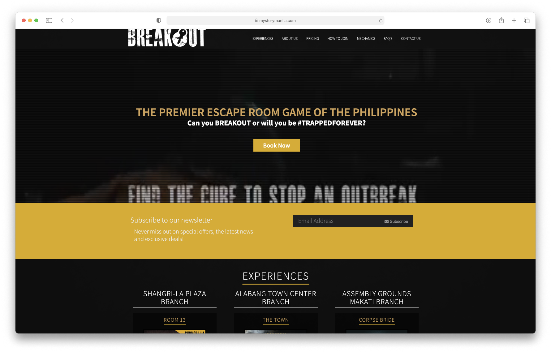
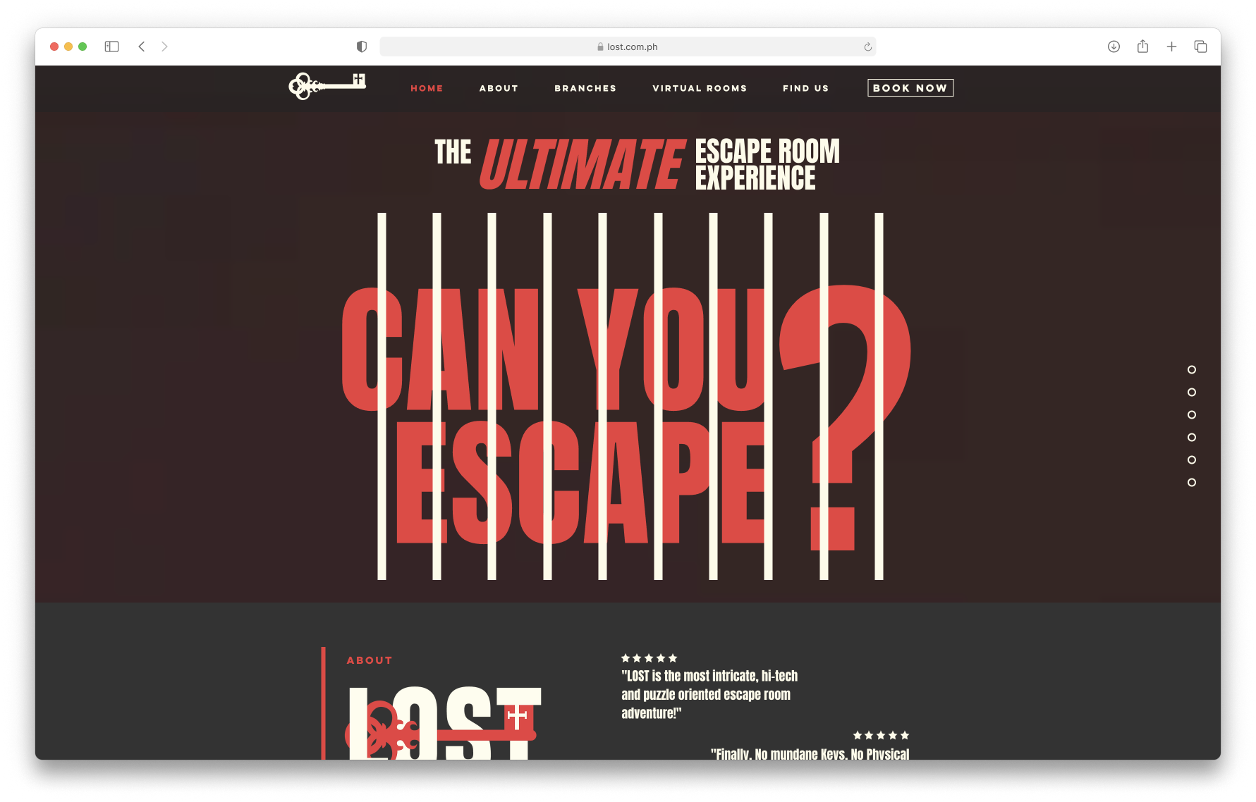
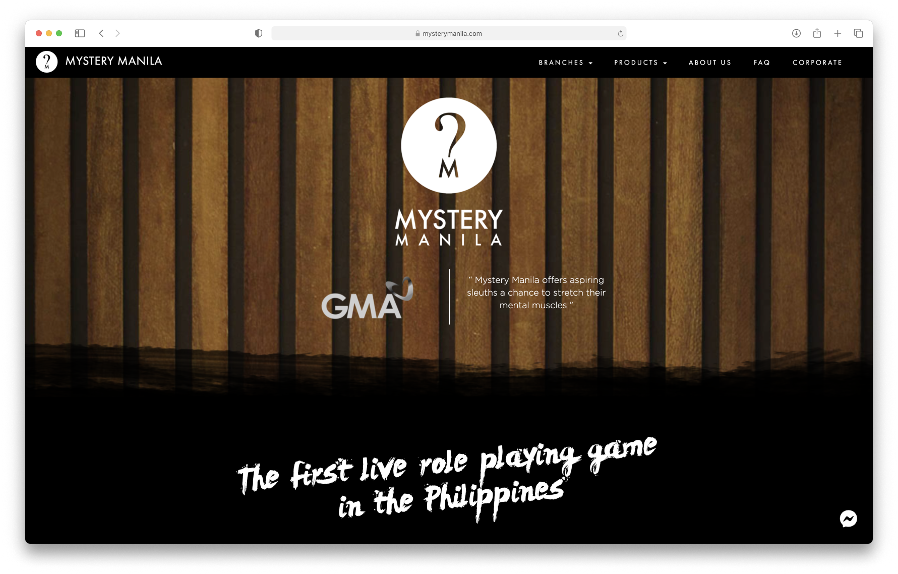
competitive analysisUpon compiling insights from participants, I conducted a comparative analysis of other escape rooms in the metro, specifically focusing on Left Behind's three major competitors: Breakout, Lost, and Mystery Manila. I found out that these key players in the field encounter similar challenges in their websites, similar to the issues identified on Left Behind's website.
https://breakout.com.ph/
https://www.lost.com.ph/
https://www.mysterymanila.com/
The prevailing problems across these platforms include challenges related to text accessibility and unclear information hierarchy. Most users also find the websites a bit overwhelming due to their single-page structure (with navigation jumping between sections), preferring each section to have its own dedicated page.
How might we redesign Left Behind’s website so we can improve the user experience and attract new customers?
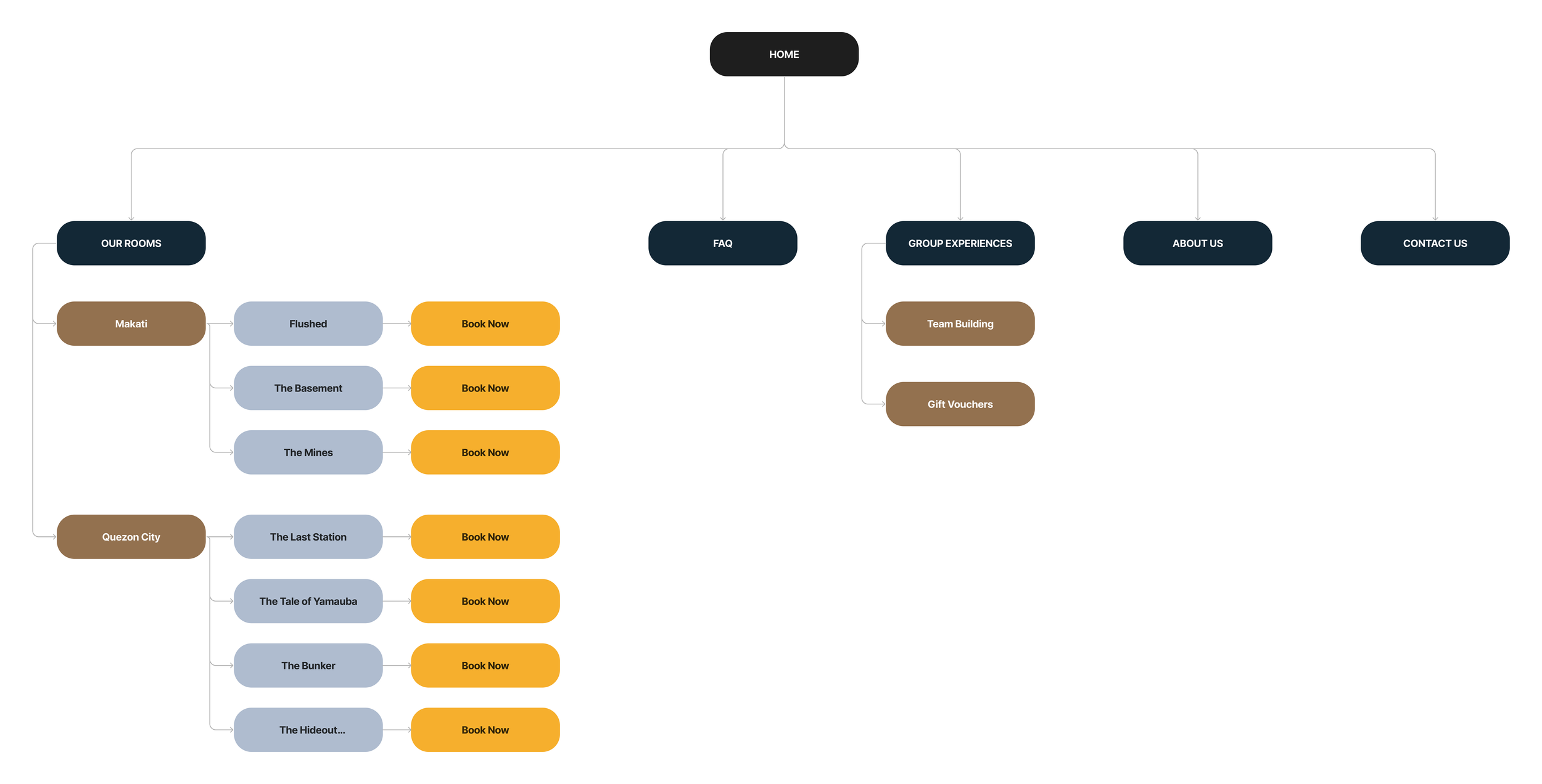
INFORMATION ARCHIECTUREBased on the mental model of our users, I redesigned the site map to align with their natural navigation tendencies. When users first visit the site, they tend to prioritize browsing through the escape rooms followed by a visit the Frequently Asked Questions page for more information.
Additionally, based on user feedback indicating confusion, I renamed ‘Corporate’ to 'Group Experiences' for clarity. This category now features a variety of experiences, including gift vouchers (previously on a separate page) and team-building options.
Updated site map for the redesign
ideationWhile evaluating the various components of the site, it became evident that the area requiring the most immediate attention was Left Behind's booking system. However, since they're currently relying on a booking system plug-in, the stakeholders and I agreed to focus on the redesign for customer acquisition as a primary phase, with plans to address the booking system in the near future.
To achieve this objective, the redesign has two primary user flows focused on onboarding potential customers. This involves providing all the necessary information about escape rooms and immersing them in the unique experience through the visuals.
Usability TestTo validate the design, I conducted two rounds of usability testing. The initial round involved an unmoderated test with 10 participants to gather their initial impressions. Following implementing changes based on this feedback, I proceeded with a second round — a moderated test conducted via Zoom with 5 participants.
Below are some comparative insights, with some of the significant revisions made during the iterative design process.
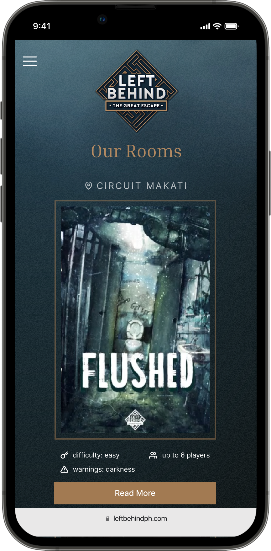
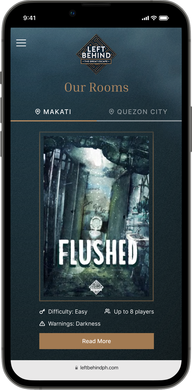
Our Rooms
Since Left Behind only has seven unique rooms between the two locations, my initial approach was to to present all of them on a single page. However, during user testing, many participants overlooked the location names. Suggestions were made to either increase the text size or introduce breakpoints.
Based on the feedback, I changed the design by dividing the rooms into two tabs and creating separate 'pages' for each location. To optimize the layout, I resized the logo to provide more space for content. I also adjusted the text size to enhance readability.
Before
After
Escape Room
I created a sticky footer on the escape room pages, which features a button that allows users to book conveniently while scrolling. Initially, I positioned the room name on the left and the button on the right. However, based on participant feedback, I realised this was redundant since the page was short, and users would have no problem remembering the room name. To address this, I extended the length of the booking button.
I also added more information (ground rules and accessibility information) to all escape room pages based on feedback from user testing.
Before
After
The feedback received from the participants regarding the website redesign was highly positive. They expressed that the new design has enhanced the user experience and interface. One of the features that stood out to them was the walkthrough on the homepage, which was a good way to introduce the concept. They were also happy with how easy it was to find all the necessary information without spending much time searching.
FINAL screensBefore
Home
The new home page is designed to immerse visitors and guiding them through the concept of escape rooms. Since Left Behind uses storytelling to describe their rooms, I mirrored this narrative in how users navigate the site. Functioning as the foreword, the home page sets the tone, effectively establishing the atmosphere and environment of the rooms, with a button at the bottom leading them towards the escape rooms.
Before
Our Rooms
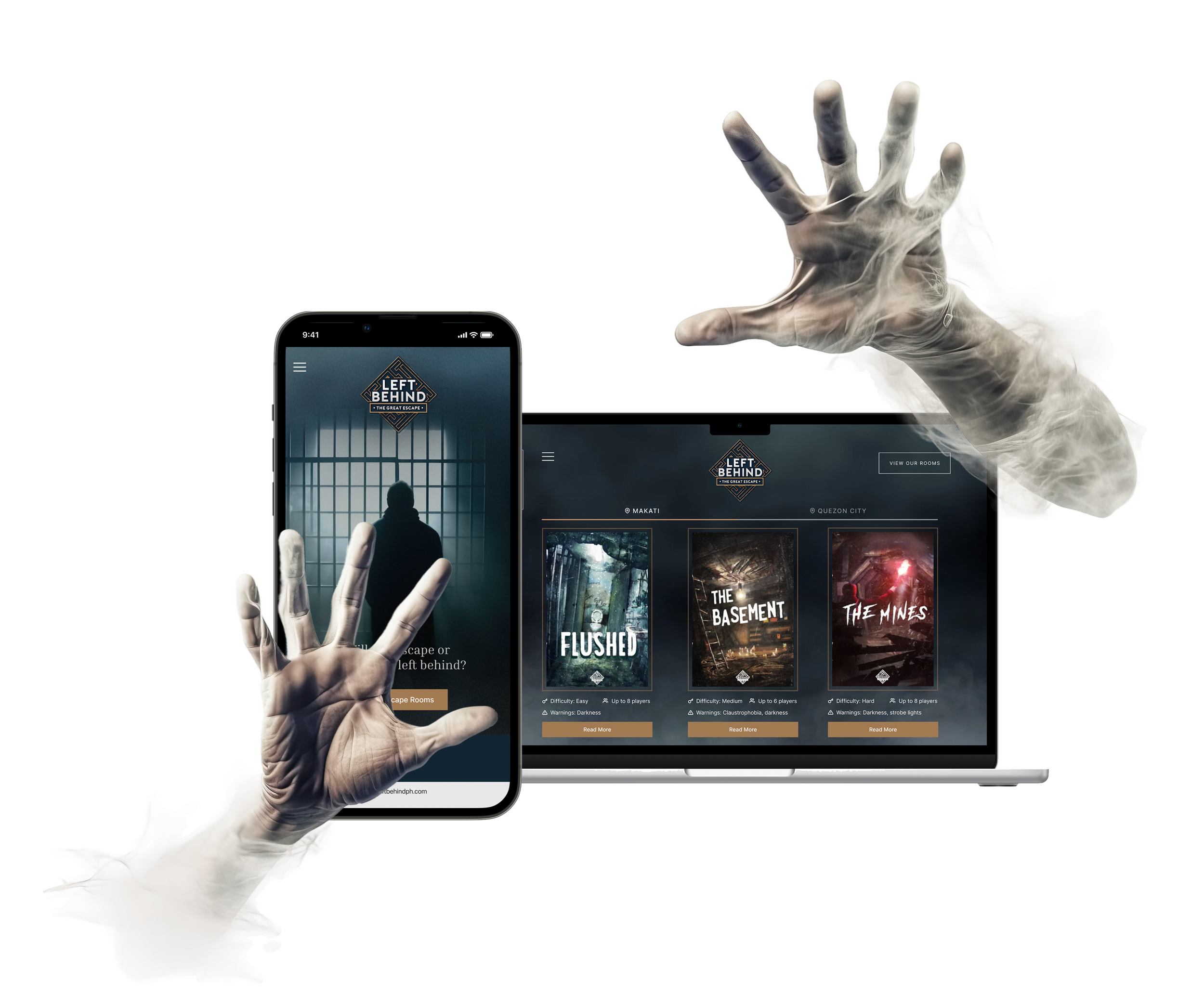
Informed by insights from user interviews, key details such as the maximum number of players allowed, difficulty level, and accessibility warnings are presented upfront, addressing specific preferences expressed by participants. To learn more, additional information is on each room's dedicated page.
Before
Escape Room
Each escape room now has its dedicated page, providing a more comprehensive experience than the previous design's pop-up approach. A preview section has been incorporated, allowing users to glimpse each room.
To make it easier for visitors to access information about each room, we have included thorough accessibility information, ground rules, and rates on every room page. This user-centric approach ensures visitors can easily find all the necessary information, making the booking process smoother.
Before
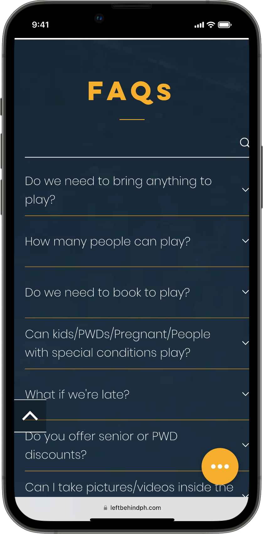
Frequently Asked Questions
The FAQ page now has a broader range of questions and a categorized structure. This is designed to facilitate ease of navigation for visitors, allowing them to swiftly scan through relevant sections and find the information they need efficiently.
Other Improvements
The redesigned navigation now has an improved information hierarchy, aligning with the natural navigation tendencies of the majority of visitors.
Meanwhile, the About page now features the story about Left Behind. Photos of their locations would’ve been perfect here but since we don’t have them on hand yet, I added a small gallery instead. This is where visitors and players alike can view some of the photos taken of each group that has been to Left Behind.


